
Chapter 6 of the VisualXSL User Guide
5. Data Fields and Properties
5.1. Data Field Properties
This chapter describes the data properties (in the Properties pane) associated with the various field types that can be added to a VisualXSL project from the Data menu. The properties are grouped according to Appearance,Custom, Data, Expression,Form Fields, Indentation, JavaSript, Location, Padding, Size, and Spaces, as described in this chapter.
Important: If a data field has been selected, the change you make to a property affects only that field.
When no data field has been selected, the change in formatting for a property affects all data fields on the section that use the template's formatting for that property. However, a data field which property (for example, font size) has been set individually, is not affected by the change of template formatting for that property.
Note: Many of the fields in the Properties panel have drop-down lists,
buttons, etc. that appear only when the data field is selected in the Properties panel.
5.2. Common Data Field Properties
The following data fields, which appear in alphabetical order under Properties pane, are used for all data fields.
Appearance
-
BackgroundColor specifies the color for the background. For example, choosing white makes the area behind the data field white in the resulting PDF.
-
BlockProperties is a subgroup that contains the following properties:
-
Alignment specifies the text alignment. The possible values are:
-
Inherit -
Left -
Center -
Right -
Justify
-
-
AlignmentLast specifies the text alignment for the last line of the text block. It has the same set of values as Alignment.
-
LineFeed corresponds to the XSL-FO linefeed-treatment property, which defines how line feed characters are handled. The possible values are :
-
Inheritsets this property to the value of the parent container. -
TreatAsSpaceforces the formatter to treat line feed characters as a space. -
Ignorelets the formatter ignore any line feed characters. -
Preservetreats all line feed characters as line breaks. -
TreatAsZeroWidthSpaceforces the formatter to treat line feed characters as a zero-width space.
Note: displaying this feature in the designer area is not implemented.
-
-
WrapOption specifies whether the text should be wrapped to fit the data field's frame.
-
-
Border is a subgroup that is used for specifying the border properties:
-
BorderColor specifies the border color.
-
BorderStyle specifies the border line style.
-
BorderWidth specifies the line width.
-
-
Orientation is the block orientation which can be used for rotating data fields. This property corresponds to the XSL-FO reference-orientation
trait. -
VerticalAlignment the texts contains the vertical alignment. The possible values are :
-
Autosets vertical alignment to the default value (Before) or to the value of the parent container. -
Beforesets vertical alignment to the top of the data field. -
Centersets vertical alignment to the center of the data field. -
Aftersets vertical alignment to the bottom of the data field.
-
-
ZOrder contains the Z-Order.
Custom
The use of the following custom properties requires knowledge in XSL-FO and XSLT.
-
CustomAttribute is a space-delimited list of new XSL-FO styles.
-
CustomProcess is used to pass a trigger into the TranslateProject.xsl where a user can then override the typical template used to process that element. This allows complete customization for any frame type in the drawing grid.
-
OverriddenAttribute specifies the XSL-FO style(s) to omit.
Data
-
Comment is used to generate comments in the resulting stylesheet. It is a description for the field. Besides, it can be helpful for navigating the document structure.
-
BorderStyle specifies the line style of the border.
-
FieldName specifies the field name.
-
Value specifies the field value.
Expression
-
Pattern is the XPath expression that selects an XML branch (node set) used for the data field.
Caution: If you manually modify the XPath expression in the Pattern property, be sure that it is correct and evaluates to an XML node set, and that this node set is a descendant of the XML node evaluated with the section Pattern property. It is suggested to validate your project to make sure all XPath expressions are correct.
-
Test contains the XPath expression that defines the conditions for showing or hiding the content.
Form Fields
-
Hidden contains two logical values: true/false. If true, field will not be shown on the layout
-
Max Length which has deafult ' 0 ' value. The maximum allowed count of the entered symbols
-
Multiline contains two logical values: true/false. If true the text field may contain more than one fields
-
Name contains automatic generated value. Required unique property for all fillable fields.
-
Noexport contains two logical values: true/false. If true
-
Password contains two logical values: true/false. If true the text field is generated as a password field: instead of symbols,
*are shown -
Printable contains two logical values: true/false. If true, the field can be printed
-
Readonly contains two logical values: true/false. If true, no data can be inserted
-
Required contains two logical values: true/false. If true, some data is required to be entered
-
Treat as Field contains two logical values: true/false. Is editable only for Text Frames and Check Boxes, as for all other fillable fields it is set
trueand isReadonly.
Indentation
-
First Line Indent contains the first-line indentation for the data field. It corresponds to the XSL-FO trait
text-indent. -
Last Line Indent contains the last-line indentation for the data field. It corresponds to the XSL-FO trait
last-line-end-indent. -
Left Indent contains the left indentation for the data field. It corresponds to the XSL-FO traits
start-indent. -
Right Indent contains the right indentation for the data field. It corresponds to the XSL-FO traits
end-indent.
JavaScript
-
On Blur can write some javascript code to invoke, when the cursor leaves the field
-
On Calculate This event is defined when a change in a form requires that all fields that have a calculation script attached to them be executed. All fields that depend on the value of the changed field will now be recalculated.
-
On Focus can write some javascript code to invoke, when a field loses or receives focus.
-
On Format can write some javascript code to invoke, when format is wrong.
-
On KeystrokeThis event occurs whenever a user types a keystroke into a text box or combo box (including cut and paste operations) or selects an item in a combo box list or list box field. A keystroke script may limit the type of keys allowed. For example, a numeric field might only allow numeric characters.
-
On MouseDown can write some javascript code to invoke, when a mouse button is pressed down in the field area.
-
On MouseEnter can write some javascript code to invoke, when a mouse pointer enters in the field area.
-
On MouseExit can write some javascript code to invoke, when a mouse pointer exits in the field area.
-
On MouseUp can write some javascript code to invoke, when a mouse is pressed up in the field area.
-
On Validate can write some javascript code to invoke, when when validate.
Location
-
Left contains the left coordinate, in points.
-
Top contains the top coordinate, in points.
Padding
-
Bottom Padding contains the padding of the text from the data field's frame's bottom border, in points.
-
Left Padding contains the padding of the text from the data field's frame's left border, in points.
-
Right Padding contains the padding of the text from the data field's frame's right border, in points.
-
Top Padding contains the padding of the text from the data field's frame's top border, in points.
Size
-
Height contains the height of the data field's frame. The value for
Heightcan use the following units of measurement:-
points (pt) -
pixels (px) -
inches (in) -
centimeters (cm) -
millimeters (mm)
Note: If no unit of measurement is specified, the default (
points) is used. -
-
Width contains the width of the data field's frame. The value for the Width property can use the same measurements as for the Height property.
Spaces
-
Space After The Area contains the height of the space after the area of the data field's frame, in the specified units. The measurements of Height and Width properties are used, the default value is
pt. -
Space Before The Area contains the height of the space before the area of the data type, in the specified units. The measurements of Height and Width properties are used, the default value is
pt.
5.3. Data Fields That Appear Only When No Editable Item Selected
The following data fields appear only when there is no editable item selected.
-
-
Did Print can write some javascript code(e.g. some alert) to invoke after printing the document.
-
Did Save can write some javascript code(e.g. some alert) to invoke after saving the document.
-
Library User can write his/her own JavaScript library for the document and use in at any desired place.
-
Open can write some javascript code(e.g. some alert) to invoke, when the document is opened.
-
Will Close can write some javascript code(e.g. some alert) to invoke, before closing the document.
-
Will Print can write some javascript code(e.g. some alert) to invoke, before printing the document.
-
-
-
BackgroundPath specifies the path to the background (PDF or image file) that is used.
-
DynamicFlow displays type of current section,
Truefor dynamic sections,Falsefor static sections. -
RasterizedPath specifies the path to the rasterized copy of background image file that has been initially specified in BackgroundPath property.
-
-
- Treat as field displays whether the section is dynamic
Trueor staticFalse. Read only.
- Treat as field displays whether the section is dynamic
5.4. Text Frame
Besides the properties mentioned in Common Data Field Properties, the following additional properties are used for Text Frames:
-
TextProperties is a subgroup that contains properties for formatting text inside the data field:
-
Font is a subgroup that specifies the text's font properties.
-
Namespecifies the font type. You can set font type via both typing the font type name into the box and choosing the font type from the drop-down list. -
Sizespecifies the font size. The measurement unit is specified by Unit. -
Unitspecifies the unit for Size. It is one of the following:-
Pixel- the Size measures in pixels. -
Point- the Size measures is points. -
Inch- the Size measures in inches. -
Millimeter- the Size measures in millimeters.
-
-
Boldspecifies whether the font is bold-faced. -
Italicspecifies whether the font is italicized. -
Strikeoutspecifies whether the font has a strike-out line through it. -
Underlinespecifies whether the font is underlined.
-
-
ForeColor specifies the text color (the foreground color).
-
-
Data
-
CustomDataFormat is a custom data format description.
-
DataFormat contains XSLT code that defines additional field formatting. For more details, see section Additional Formatting for Data Fields , where there is also a table of available codes.
Note: The application does not provide the list of codes and does not check their validity. If an incorrect value is set for this property, the default code (
0) is used in the resulting XSL. -
DataType specifies the data type stored in the XML source. This property provides information that is necessary for formatting the text from the XML source. Currently, only the
DateandTexttypes are supported. -
Text is a design-time text to be displayed at the layout. It has special meaning for some fields. For more information see below, at
Imageand atSpecial Fields.
-
-
Expression
- XPathValue is an XPath expression that returns a value from a node set defined in the Pattern property.
5.5. Barcode
Besides the properties mentioned in Common Data Field Properties, the following additional properties are used for barcodes:
-
-
Module is the width of the narrowest stripe in the barcode, in one of the following measures:
-
pixels (px) -
points (pt) -
inches (in) -
centimeters (cm) -
millimeters (mm)
Note: The default measure is
pixels (px)Use this parameter to control the width and height of the barcode.
-
-
-
-
Type is the barcode type. Available barcode types are:
-
EAN8 -
EAN13 -
UPC-A -
UPC-E -
Interleaved 2 of 5 -
Code 39 -
Codabar -
Code 128 -
Australia Post 4-State
Note: No validation of an XPath expression result to the barcode specification rules is available.
-
-
5.6. Check Box
Besides the properties mentioned in Common Data Field Properties, the following additional properties are used for check boxes:
-
-
CheckType specifies the style of the check mark. The possible values are:
-
Default -
Check -
LightCheck -
LightCross -
Cross -
LightWavyCross -
WavyCross -
Plus -
EmptyPlus -
Bullet -
EmptyBullet -
Square -
EmptySquare
-
-
FontSize specifies the font size of the check mark inside the field.
-
-
-
BorderStylespecifies the style of the check box's border. The possible values are:-
None -
Solid -
Beveled -
Dashed -
Inset -
Underline
-
-
CheckStylespecifies the style of the check box. The possible values are:-
None -
Check -
Circle -
Cross -
Diamond -
Square -
Star
-
-
FieldNamespecifies -
Valuespecifies
-
5.7. Image
Besides the properties mentioned in Common Data Field Properties, the following additional properties are used for images:
-
-
ImageUrl is the URL or the local path to the image file. By default it is a static path to the image. To change it, click the
button, which opens the file browse dialog. If you want to use XPathValue to extract a part of the URI from XML, use the tag {xpath-value} inside the ImageUrl property.Note: XPathValue, in Expression, by default is not used for a newly created field. To extract the image URI from the source XML using XPath, you should manually edit the ImageUrl property. For more details, see the following example.
-
Example
Suppose we have employees' photos that are stored in a shared folder of our intranet server. All files are named in the following way:
http://intranet-server.com/photo/XXXX.jpg, whereXXXXis a serial number from 1 to 9999.Suppose that we also have the following XML fragment describing every employee:
<employees>
              <record id="1">
                 <name>John Doe</name>
              </record>
              <record id="2">
                 <name>Adam Smith</name>
              </record>
              </employees>
We should use the following values to render images in our document:
Property Value ImageUrl http://intranet-server.com/photo/{**xpath-value**}.jpg XPathValue @id Pattern records/record
-
-
Expression
5.8. Special Fields
You can insert special fields into the project. When generating the XSL stylesheet, the special fields are transformed into XSL parameters. This feature enables you to set some values at the XSL transformation stage.
Special fields are described in the format-plugin.xml (it is created in the ProgramFiles/RenderX/VisualXSL/XSL folder). To insert a special field, drag and drop its XML node from the XML tree view onto the layout. Change the value of the XPathValue property of the created object's properties to the name of the desired field (see the following list). The name should be specified with the preceding symbol $.
| Field Name | Description | Default Value |
| PrintDate | Date when the project was last transformed | Current date |
| CreateDate | Date when the project was created | None |
| AuthorName | Name of the project author | None |
| CompanyName | Name of the author’s company | None |
You can also insert a custom special field, which is later transformed into a stylesheet parameter. Set the XPathValue property to $<special-name>, where special-name is CName (it satisfies standard XSL rules of naming variables). Set the default value of the parameter by changing the Text property.
5.9 Additional Formatting for Data Fields
Data field contents can be customized by additional formatting. Currently, only different date formats are implemented:
-
ISO8601 format (
yyyy-mm-ddThh:mm:ss:mmm) -
ODBC canonical format (
yyyy-mm-dd hh:mi:ss)
Note: The date value in source XML file should be properly specified in one of the implemented formats.
Select the field containing the correct date value for formatting application. Switch to its object properties, and choose Date value for the DataType property. Then specify the format code for the DataFormat property. All supported format codes are listed in the table below. To refresh the designer area (and see the updated formatting of the data field), click the Refresh button.
Code
Description
without century
with century
1
101
USA mm/dd/yy
2
102
ANSI yy.mm.dd
3
103
British/French dd/mm/yy
4
104
German dd.mm.yy
5
105
Italian dd-mm-yy
6
106
dd mon yy
7
107
Mon dd, yy
8
108
hh:mm:ss
9 or 109
Default + milliseconds mon dd yyyy hh:mi:ss:mmmAM (or PM)
10
110
USA mm-dd-yy
11
111
JAPAN yy/mm/dd
12
112
ISO yymmdd
13 or 113
Europe default + milliseconds dd mon yyyy hh:mm:ss:mmm(24h)
14
114
- hh:mi:ss:mmm(24h)
20 or 120
ODBC canonical yyyy-mm-dd hh:mi:ss(24h)
21 or 121
ODBC canonical (with milliseconds) yyyy-mm-dd hh:mi:ss.mmm(24h)
-
126
ISO8601 yyyy-mm-ddThh:mm:ss:mmm(no spaces)
Note: Milliseconds (if they are specified in the XML data for the field) are not rendered after the layout is refreshed, but are rendered in the resulting PDF document.
5.10. Address Block
The application provides Address Block Wizard for adding address labels. The resulting label is aligned vertically to the bottom of the label and consists of four or five address lines. There are three areas in the wizard dialog (see the following figure). The first area, at the left of the dialog, is a tree representing the first element of the XML source file (only the first batch of the XML source is visible in the XML Tree View). The second area, at the upper-right of the dialog, is a group of textboxes for the parts of the address. The third area, at the lower-right of the dialog, is a preview for the address label. You can add data from the XML tree to text boxes by double-clicking on the tree node, by dragging nodes into the Layout, or by clicking the Add button.
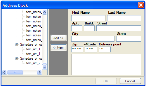

Figure 5.1. Address Block Wizard
If you click the Add button, data is added to the highlighted text box. If you add new data to a text box that already contains some data, the new data replaces the old data. To clear the highlighted text box, click the Remove button. The data is added from the XML tree in such a way that it is dynamically inserted into the resulting document. Besides, you can type some static data if you need it.
The application forms the PostNet barcode from the three last text boxes (ZipCode, +4Code, Delivery Point). It assumes that all data typed into them are numeric, so make sure that the XML data represents a proper number for a post code.
Address blocks are generated as a special kind of Paragraph Block. This means that they can be edited as both Paragraph and as Address. Editing as Address allows you to visually modify address-related fields, while editing as Paragraph provides with assigning fonts, colors, and customizing order and layout of address fields. The application has possibility for both ways of editing Address blocks.
Double-clicking on Address Frame invokes Address editor to allow changing Address fields.
Procedure 5.1. To invoke Paragraph editor on Address block
-
Create an Address block using the Wizard
-
Close the Wizard to save your initial changes
-
Right-click the Address block on layout
-
Select Edit Paragraph pop-up menu item (see Figure 5.2)
-
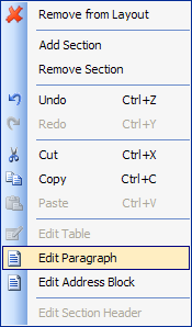
Figure 5.2. Selecting Edit Paragraph option in Address Block Wizard
-
The paragraph editor will open the content of the Address block (see Figure 5.3).
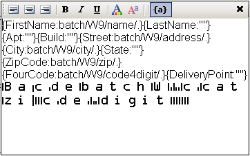
Figure 5.3. Editing Paragraph in Address Block Wizard
The fields of wizard block are specified in curl brackets. Before semicolon symbol “:” there is name of field, after that symbol there is content of that filed. To set special font setting, it is important to select the content of filed and from toolbar set the appropriate formatting. It is impossible to see the formatting options while you are editing the address block in wizard. For font options visualization you could press toggle view button “{a}” which is located on paragraph toolbar and could see the view of address label which will be in resulting document.
Note: Currently, the application has no option for specifying the fonts to be used in document formatting. Therefore, to describe the PostNet True Type font, you should manually edit the configuration file for IREn and add a section as shown in the following example.
Procedure 5.2. To manually edit the configuration file:
Assume that XEPWin is installed in the C:\Program Files\RenderX\XEPWin folder.
-
Open the
XEP.xmlfile fromxepsubfolder. -
Find the
font-groupXML element with@label="Windows TrueType"attribute. -
Add the following text inside the found element:
<font-family name="IDAutomationPOSTNET" embed="true">
    <font>
        <font-data ttf="IDAutomationPOSTNET.ttf"/>
    </font>
</font-family>
This enables the for the IREn formatter to use True Type font to render PostNet barcodes.
5.11. Paragraph Block
You can put paragraphs with different formatting properties into one block container, or paragraph block. An example of such a paragraph block is an address block. Using a paragraph block allows you to prepare text blocks using XML data of variable length.
Note: You cannot leave any data field blank, but at least one block must be filled.
Using a paragraph block also helps when you wish to apply different formatting to different parts of one paragraph.
Initially, when you add a paragraph block to the project (from the Add Paragraph | Data menu), it has one paragraph. The content of the block is rendered from the selected XML node. You should select Edit | Edit Paragraph from the menu or double-click on the Paragraph block in order to add a new paragraph, or to edit existing ones inside the block. This brings up the following view:
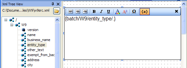
Figure 5.4. Empty paragraph block added to the layout
You can type static text into the paragraph block, drag and drop nodes with data from the XML tree, or type an XPath expression inside curly brackets ({}). To apply formatting to the text, select it, and then click the appropriate toolbar button.
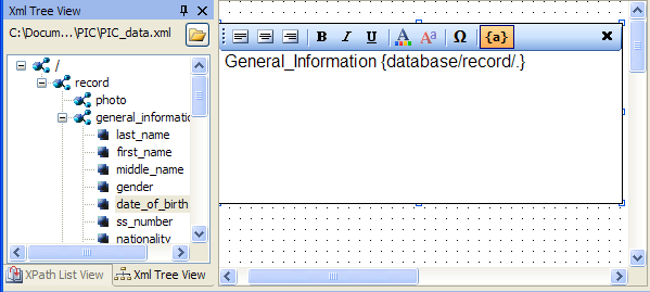
Figure 5.5. Editing the paragraph block - some data fields and static text have been added
To finish editing the paragraph, select Edit | Finish Editing Paragraph, or click the Cross (X) button.
Caution: Before editing a paragraph block, ensure that the entire block on the Layout (the Designer Area) is visible to you. In some cases, you must scroll the Layout manually to see all text being edited.
Note:
undo/redois not supported while editing the paragraph block.
5.12. Table
The following additional data field is used for tables.
-
-
RepeaterPattern is the context with which the table data will repeat.
For example, if you have XML as
root/customersand there are many/customerelements below/customers, theTableXPath expression would beroot/customersand the table RepeaterPattern would beroot/customers/customer.
-
5.13. PageNumber
Page Number is a Paragraph, which contains a special text, to show current page number in the document.
By default, Page Number is in Page ' i ' of count format, where ' i ' is the current page's number and count is the count of the pages in the document.
5.14. Output Formats
You can get following Output formats with VisualXSL :
-
PDF -Portable Document Format
-
PS - PostScript
-
AFP - Advanced Function Printing
-
IREn Intermediate
-
SVG - Scalable Vector Graphics
-
HTML - Hyper Text Markup Language
-
XPS - XML Paper Specification
Note: To be able to use those Output formats you need:
a license file allowing to use PDF, PS, SVG, HTML, XPS
a separate license file allowing to use AFP (because of Formatter behaves differently seeing AFP backend in the license file - namely, disabling kerning and some other features)
Procedure 5.3. Creating Output formats
Note: The default Output format of VisualXSL is PDF
-
To choose the output format for the document,select Build | Set Output Formats from menu or click the
Set Output Formatbutton: <;/p>
.
-
From the drop-down list, select either PostScript,AFP,IREn Intermediate,SVG,HTML or XPS. (PPML is not Supported yet).
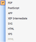
Figure 5.6. Choosing document format
Note: For more information about Output formats see RenderX IREn
5.15. PDF Forms
VisualXSL 2.3 and later versions provide a new way of creating fillable Acrobat® forms. From now on VisualXSL uses IREn to create fillable forms, which made this process fast and simple. The process of creating fillable forms fully differs from the processes used in previews versions. First, creating fillable form is not a separate process, furthermore, the fillable fields are created like any other field; the only difference is Treat as Field property in the Properties pane. If Treat as Field is set to true, in the resulting PDF the field will be a created as a fillable field, otherwise the field will be a normal PDF field.
Important: Forms are only applicable to PDF output format and will not work for other formats.
Important: In order to create fillable Forms, IREn requires a special license. The license file should be put in
xepfolder in the XEPWin installation folder.
Note: In the 2.3 version VisualXSL supports as fillable fields only Text Frames, CheckBoxes, RadioButtons, Buttons, ListBoxes and ComboBoxes. Other frames cannot be created as fillable form fields. Each frame is described above at this section.
Note: It is no longer required to set PDF background in order to create fillable forms.
Common Properties For PDF Forms
All the frames which can be made fillable PDF fields have several common properties. You can set/view them at the Properties pane.
-
Threat As Fields - is editable only for Text Frames and Check Boxes, as for all other fillable fields it is set
trueand isReadonly. -
Name - required unique property for all fillable fields. By default VisualXSL generates a unique name for all fields, but you can change Name property for fillable fields.
Note: Be sure NOT to have multiple fillable fields with the same Name. Otherwise, fields will not be generated normally.
-
Readonly - if true, no data can be inserted
-
Required - if true, some data is required to be entered
-
Noexport - if true,
-
Hidden - if true, field will not be shown on the layout
-
Printable - if true, the field can be printed
Text Frame
Besides the common properties Text Frame has some specific properties.
-
Text - the default text entered into the field
-
Multiline - if true the text field may contain more than one field
-
Password - if true the text field is generated as a password field: instead of symbols,
*are shown -
Max Length - the maximum allowed count of the entered symbols
Check Box and Radio Button
Besides the common properties Radio Button has some specific properties.
-
Group Name - required property to indicate separate Radio Buttons groups. All the radio buttons with the same Group Names are in one radio group. VisualXSL defaults a unique Group Name for Radio Buttons, but you can set your own names.
-
Initially Selected - indicates if the field is initially selected
-
RadioButtons are generated as series of CheckBoxes. You just need to
-
Create several CheckBoxes
-
In the Test properties of each CheckBox give the same left part (e.g. if there are several conditions that compare certain XPath expression with different constant values)</p>
-
Set the CheckBoxes' Treat as Field properties to
true -
Generate the resulting PDF document
See Example of Using Radio Buttons for an example of generating Radio Buttons.
-
Button
VisualXSL 2.3 supports two types of buttons : Submit and Reset. The button's type is set via Button Type property. By default it is set Submit
Common Properties For Button
All buttons have some common properties.
-
Fields - space delimited list of affected field names. If empty string is given, all fields are included. The default value is empty string.
-
Text - Text shown on the button
Submit
Submit Button is used for submitting form data to the server. Besides the common properties, it contains some others:
-
Url - Required, the server URL, to which the data will be sent. By default its value is the inner text of the XML node.
-
Submit Format - Possible values are :
XFDF,FDF,PDF,HTML. The default value isXFDF -
Method - Possible values are :
POSTandGET. The default value isPOST
Reset
Reset Button is used to reset all the fields values, which names are in Fields list
ListBox and ComboBox
Both ListBox and ComboBox are tools, which allows the user to select one or more values from the given list.
-
Multiselect - indicates, if multiple values can be selected
-
Values - list of selectable values, delimited by the given Separator. By default its value is the inner text of the XML node.
-
Separator - a symbol, indicating the separator for Values field by default its value is |.
Also, ComboBox has one more property:
- Editable - indicates if a value can be typed, or the value can only be selected from the given list
Example of creating a fillable Acrobat® form
Procedure 5.4. To create a fillable Acrobat® form
Assume you already have some frames on your document and now want to add some fillable ones.
-
Add the frames you wish to make fillable (e.g. Text Frames, CheckBoxes and RadioButtons)
-
Select those frames, which will be fillable fields and navigate to Properties pane.
-
Change the Treat as Field properties value to
true(by default it is set tofalse). -
Create resulting PDF file
5.16. JavaScript For PDF Forms
VisualXSL 2.3 and later versions support JavaScript for PDF forms. You can write JavaScript code for fillable PDF fields, for pages and for the PDF document, also you can write your JavaScript library for the PDF document. For fillable fields JavaScript is written in JavaScript For Document properties in the Properties pane.
JavaScript For Fillable Fields
All the fillable fields (Text Frames, Checkboxes, Radio Buttons, Buttons, Listboxes, ComboBoxes) support JavaScript events. Bellow is the list of supported events.
-
On Blur - invokes when the cursor leaves the field
-
On Calculate - This event is defined when a change in a form requires that all fields that have a calculation script attached to them be executed. All fields that depend on the value of the changed field will now be recalculated.
-
On Focus - invokes when a field loses or receives focus.
-
On Format - invokes when format is wrong.
-
On Keystroke - This event occurs whenever a user types a keystroke into a text box or combo box (including cut and paste operations) or selects an item in a combo box list or list box field. A keystroke script may limit the type of keys allowed. For example, a numeric field might only allow numeric characters.
-
On Mouse Down - invokes when a mouse button is pressed down in the field area.
-
On Mouse Enter - invokes when a mouse pointer enters in the field area.
-
On Mouse Exit - invokes when a mouse pointer exits in the field area.
-
On Mouse Up - invokes when a mouse is pressed up in the field area.
-
On Validate - invokes when validate.
JavaScript Example For PDF Forms
Procedure 5.5. To create a PDF file with JavaScript
-
Create Project
-
Add a text frame
-
Select the added frame and navigate to Properties pane.
-
Write
app.alert("OnBlur is invoked");JavaScript code into On Blur property -
Create resulting PDF file
JavaScript For Pages
VisualXSL 2.3 supports two JavaScript events for pages. Which can be found among JavaScript For Pages properties in the Properties pane.
-
Js Open - invokes when new page is opened.
-
Js Close - invokes when window is closed.
These are hooks for events of a page coming into or out of the view in the PDF reader. They go transparently to <xep:page> and then to Page objects in PDF document for each page created with the page master where the attributes were set.
JavaScript Example For Pages
Procedure 5.6. To create a PDF file with JavaScript for pages
-
Create Project
-
Select the layout and navigate to Properties pane.
-
Write
app.alert("Page is Opened");JavaScript code into Js Open property -
Create resulting PDF file
JavaScript For Document
VisualXSL 2.3 supports several JavaScript events for the document. Which can be found among JavaScript For Document properties in the Properties pane.
-
Js Open - invokes when the document is opened.
-
Js Did Print - invokes after printing the document.
-
Js Did Save - invokes after saving the document.
-
Js Will Close - invokes before closing the document.
-
Js Will Print - invokes before printing the document.
VisualXSL 2.3 also allows the user to write his/her own JavaScript library for the document and use in at any desired place. The library is written in the Library property under JavaScript For Document property group in the Properties pane.
JavaScript For Document Example
Procedure 5.7. To create a PDF file with JavaScript for the document
-
Create Project
-
Select the layout and navigate to Properties pane.
-
Write
function f() { app.alert("function f() is called"); }JavaScript code at Library property -
Write
f();JavaScript code into the Js Open property -
Create resulting PDF file
-
Open the created PDF file. See the "function f() is called" message.